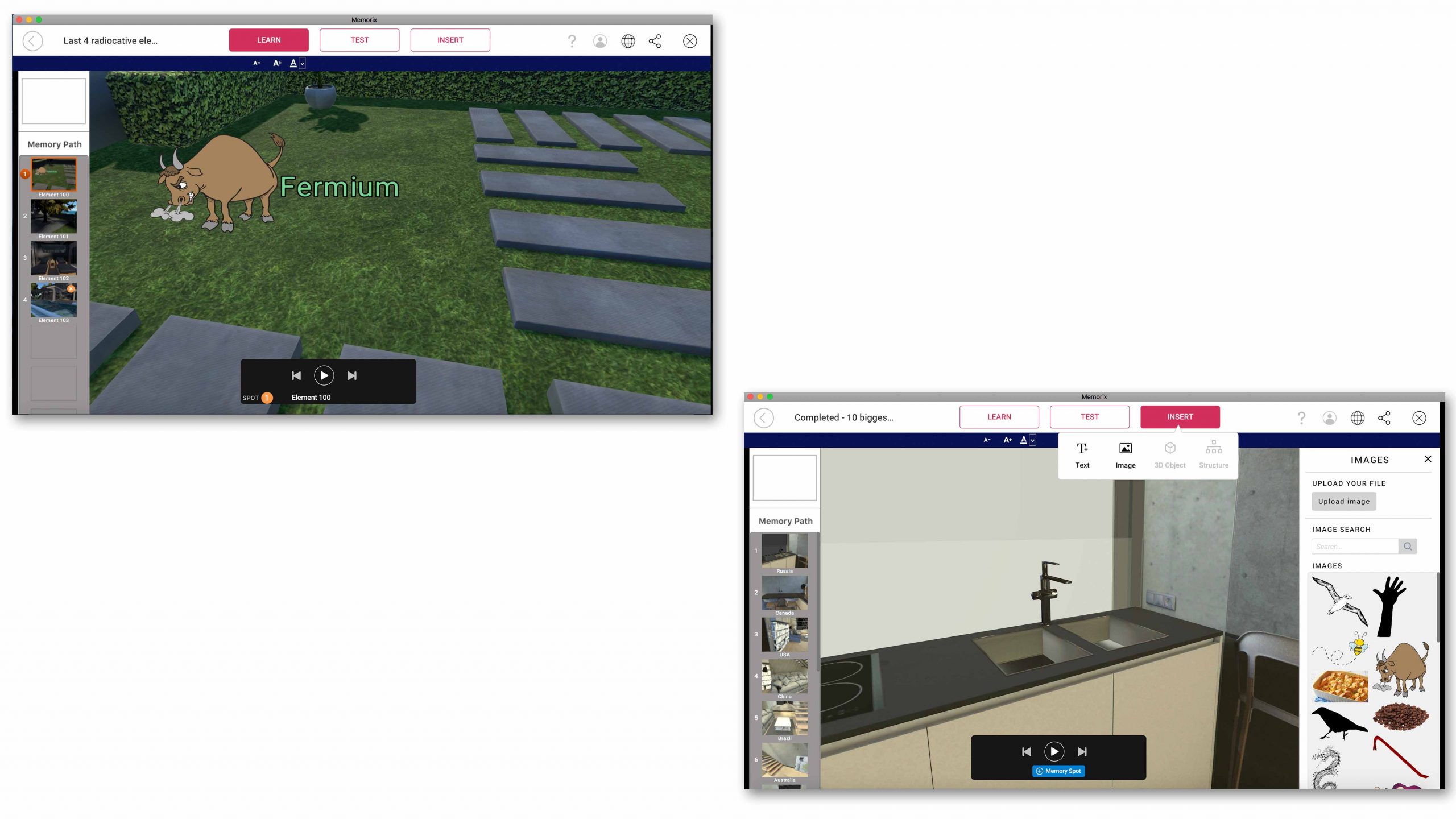
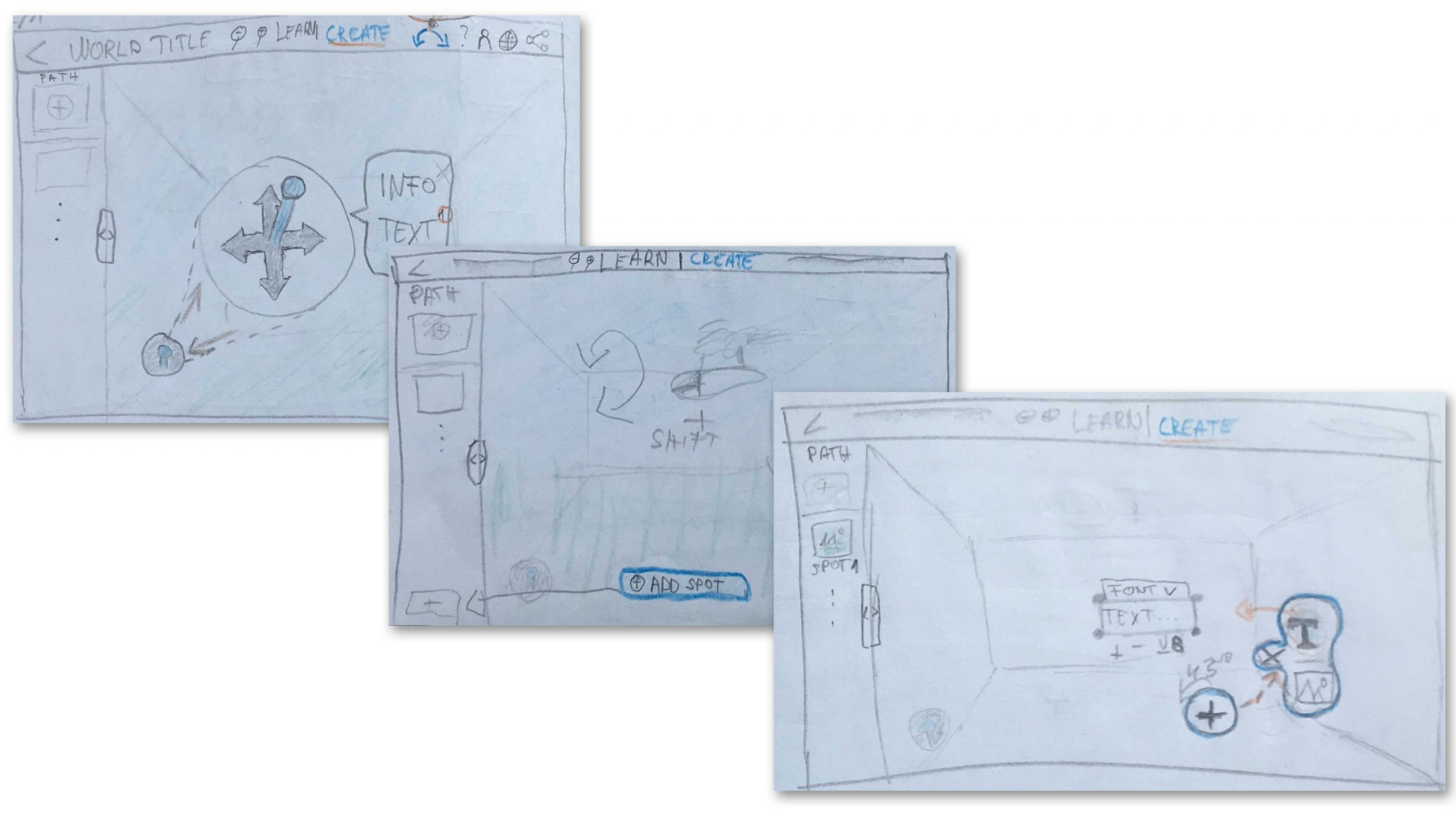
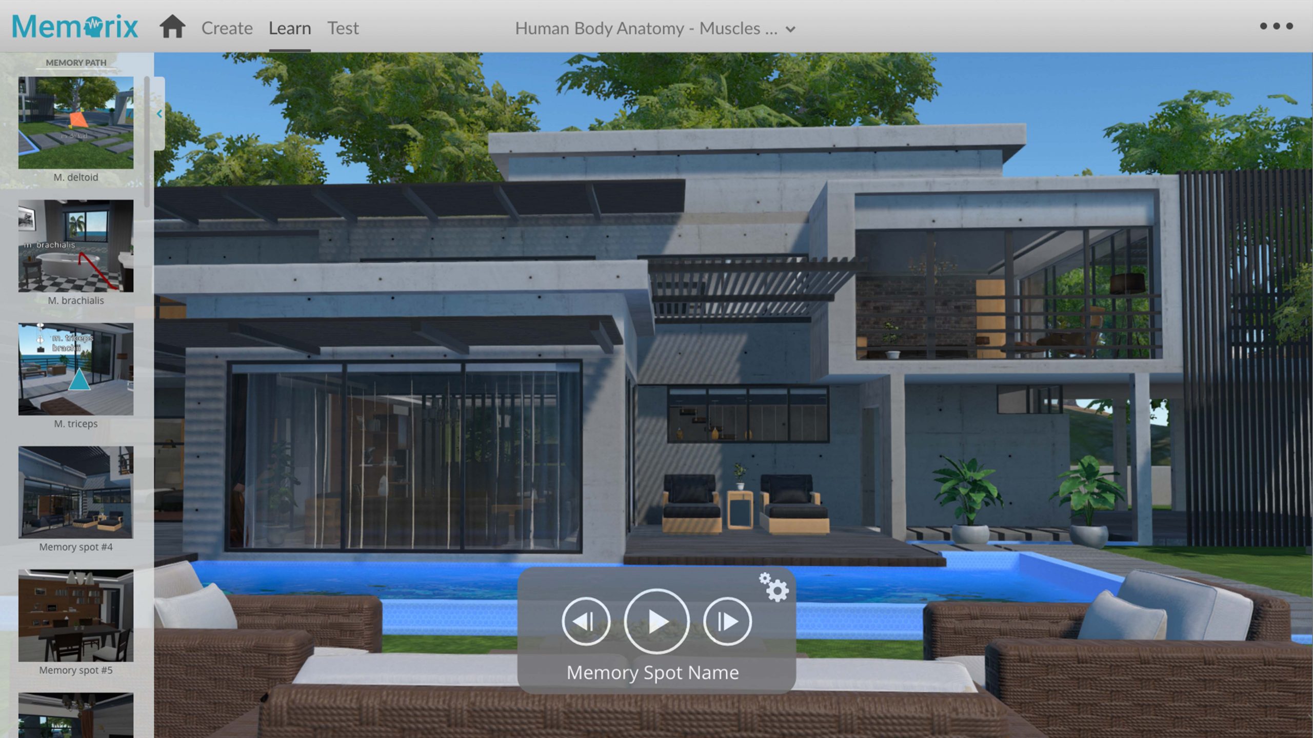
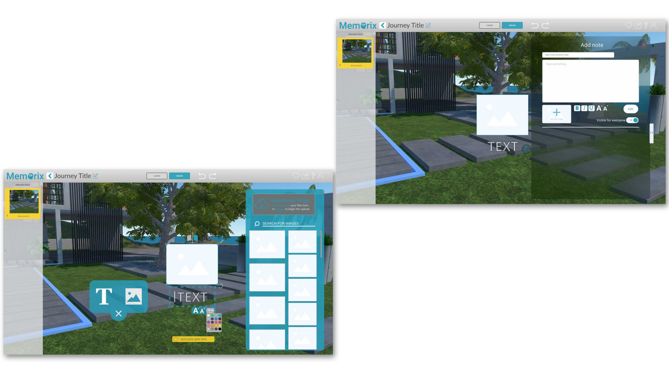
The User interface of Memorix
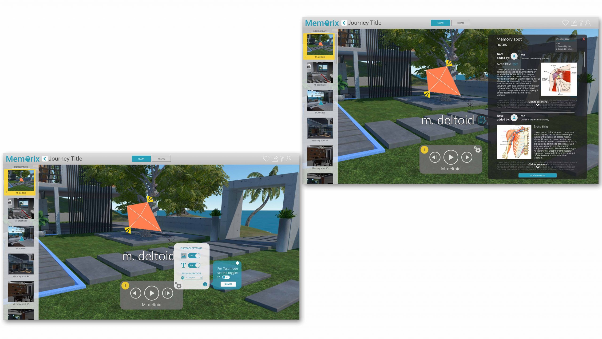
Memorix is an effective tool to memorise repetitive materials what built in unity. The method relies on the Memory Palace technique when you pairing location based memories with matching visuals and associations. The main challenge was to design a neat and minimalistic user interface what serves the ultimate goal: Make memorisation effective and painless.
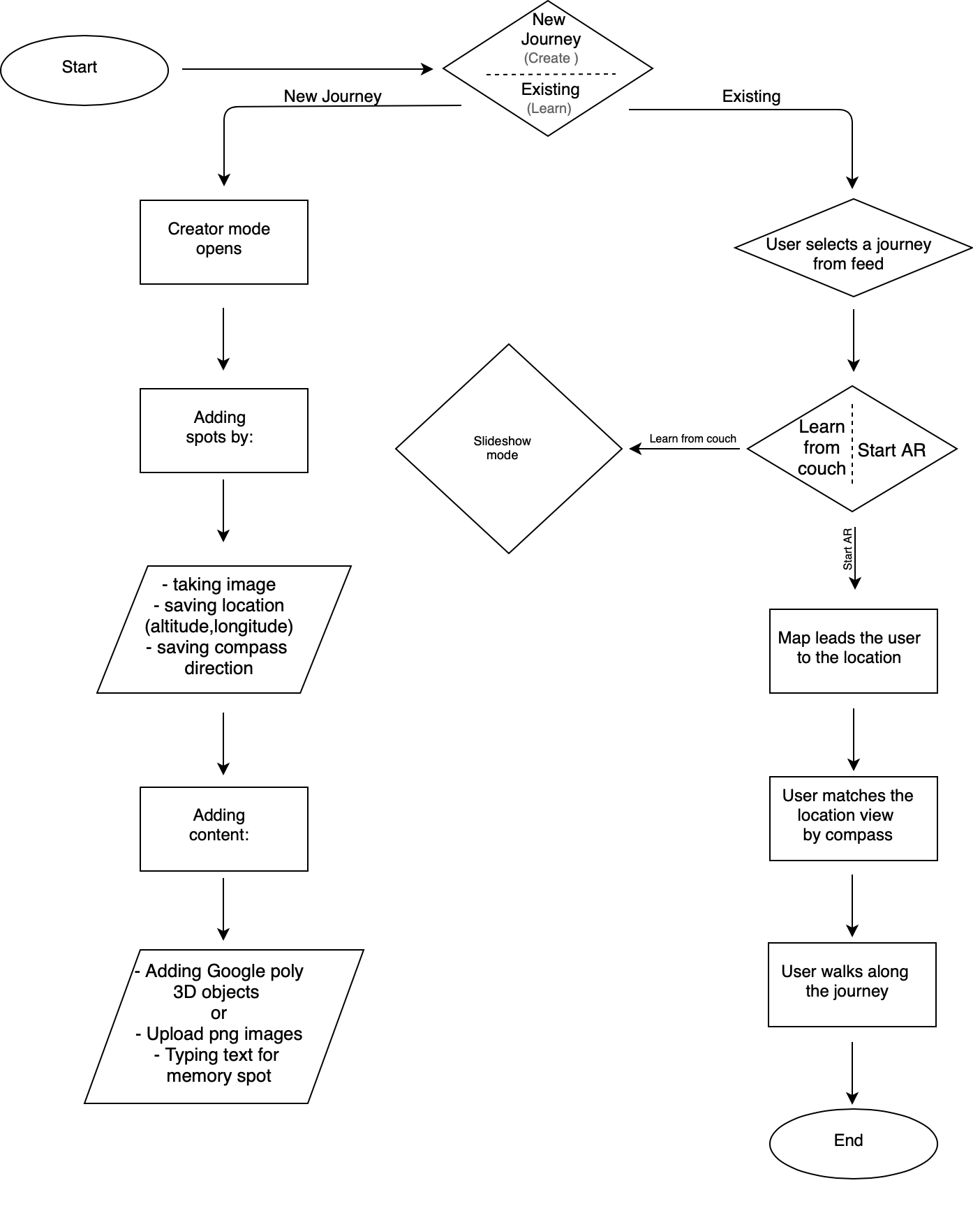
In order to meet the user demands we had user tests every week during the last sprints and we focused on to find balance and harmony between the assets and needs. Hereby you can see my clickable Adobe XD prototype. It shows a basic flow for the learner’s and the creator’s mode with the instance task to memorise the human arm muscles with few examples.
Customer
Memorix.dk
Tasks
User experience research / User interface design / Graphic design / Web design
tools
Design Thinking / Wireframing / Brainstorming / Adobe XD / Adobe Illustrator
Below you can see the mobile permutation of two user cases. I created a mobile version of learner’s mode to grant a possibility for the users to be able learn their desired material on-the-go.
A fellow designer at Memorix planned the UI of the user dashboard on desktop, but I got the honoured task to project this layout in mobile view based on her designs. Beside the dashboard I also planned a mobile layout for responsive website of Memorix.
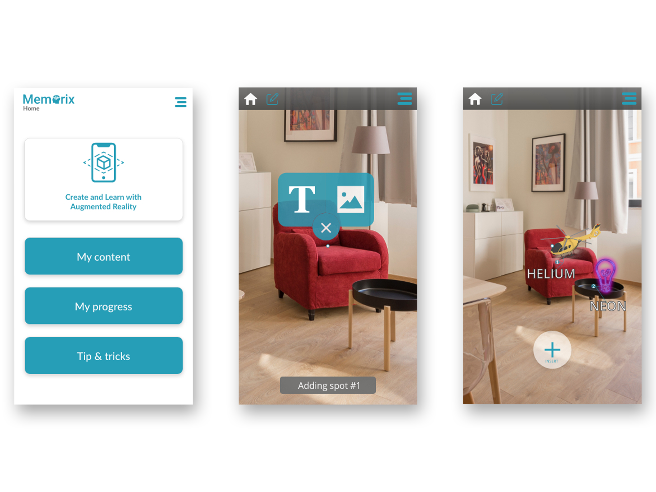
The augmented reality app
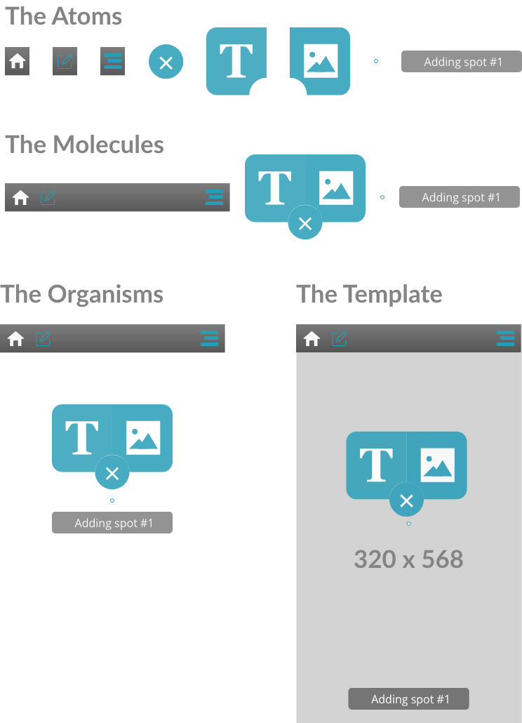
As a BA diploma project I decided to pick Memorix with a twist: I want to arrange the “memory spots” around myself, in my surrounding. In order to design this feature I had to dig deep in the anatomy of AR apps both visually and technically.
The experience mainly tailored for smartphones in this scenario.
Task
User experience research / User interface design / Graphic design
tools
Design Thinking / Wireframing / Brainstorming / Adobe XD / Adobe Illustrator
+ If memorix were yellops...
One day our leadership came up with the brainstorm topic, to create a possible re-brand of Memorix. The name (Yellops), the color palette (yellow, coral pink, cyan purple & dark grey) were tied but otherwise we had the opportunity to freely design a brand ID and a landing page for it. We had approximately 90 mins for these drafts. Below you can see how I imagined:


